Karin Conroy* A logo serves as a visual representation of your brand, and an opportunity for you to make an impression on people seeing that logo for the first time. A strong logo will reflect your law firm’s personality and the quality of your work. It should be simple, yet also professional.
No matter how large or small your firm is, it will benefit from a strong, professionally designed logo.
Here are just a few of some of the design characteristics you should be looking for in a logo.
Simplicity:
A logo should be immediately recognizable, and get across your brand’s personality with a single glance, no matter where it appears or how large it’s printed. It can be quite difficult to accomplish a perfect balance of simplicity and personality, but in general, you should always err on the side of simplicity with your chosen design.
Professionalism:
Law firms in particular must create a professional brand identity so they can position themselves as trustworthy authorities in their practice areas. A logo that is not just professionally created but exudes professionalism in itself is important for developing confidence in your brand.
Putting the effort into a well-crafted, professional- looking logo shows you care about how your firm is perceived, and that you have a keen attention to detail.
Smart color combinations:
Remember that certain colors evoke certain feelings. Make sure the colors you choose instill the feelings you want in your clients. In addition, try to avoid choosing more than two or three colors to use in your logo, as the more colors you use the more likely they are to clash. In addition, complicated color schemes can be difficult to reproduce in print.
Representation:
Does your logo represent your firm and the kind of work it does? A logo for a personal injury firm might use different design elements than a logo for an estate planning firm, or contract law firm. The clientele and legal approaches vary across practice areas, and so too should your design focuses.
This article on Lawyerist has some great examples of firms who created high-quality, simple logos that worked perfectly for their firms.*
In looking at these examples, you can see how everything from the font choices to the colors and design elements flow together to create logos that work well for these brands.
Ultimately, as important as a logo is, it’s also important to keep in mind that your logo is only a visual representation of your brand, and not the brand itself.
The harder (and more important) work is building up a brand reputation that is strong and trusted, which you can then reinforce with a high-quality logo.
Contact us today to learn more about the most important elements of a great law firm logo.
Author
Karin Conroy is the founder of law firm branding agency Conroy Creative Counsel and is an award-winning creative consultant who has worked with law firms on their marketing and creative branding and strategies.
*Great law firm logo examples noted from The Lawyerlist
My criteria were that the logo should be unique in color or font, should express and support the firm’s overall image, and have elements that are memorable.
Orrick
This logo is a great example of simple color and great font use, with a graphic that is memorable. The green will stand out, and the large capital O is clean and simple, but will be easily recalled.
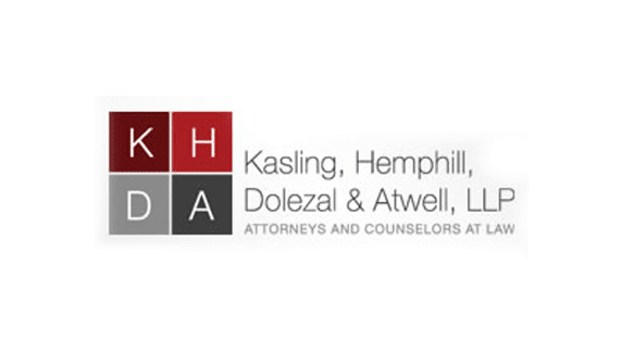
Kasling, Hemphill, Dolezal and Atwell
I like this logo because it stays within the safe confines of looking like a law firm, but uses a contemporary font and unique grid for displaying the initials so that it challenges the typical boring law firm logos.
Parkway Law
This is a logo that my firm helped to create. It works because the simple leaf conveys her focus on environmental law and provides a pop of color, while the font is classic but unique.
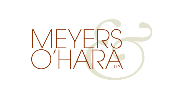
Meyers & O’Hara
This logo is also well done in its choice of font, the ampersand graphic, and simple but professional use of color.
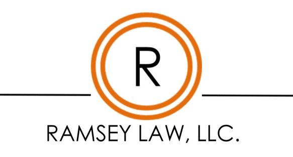
Ramsey Law
This firm did a good job with their logo but has fallen a little flat with continuing the look through to the website. However the logo is clean, has a good use of color, and the capital R is memorable in the same ways as the O in the Orrick logo above.